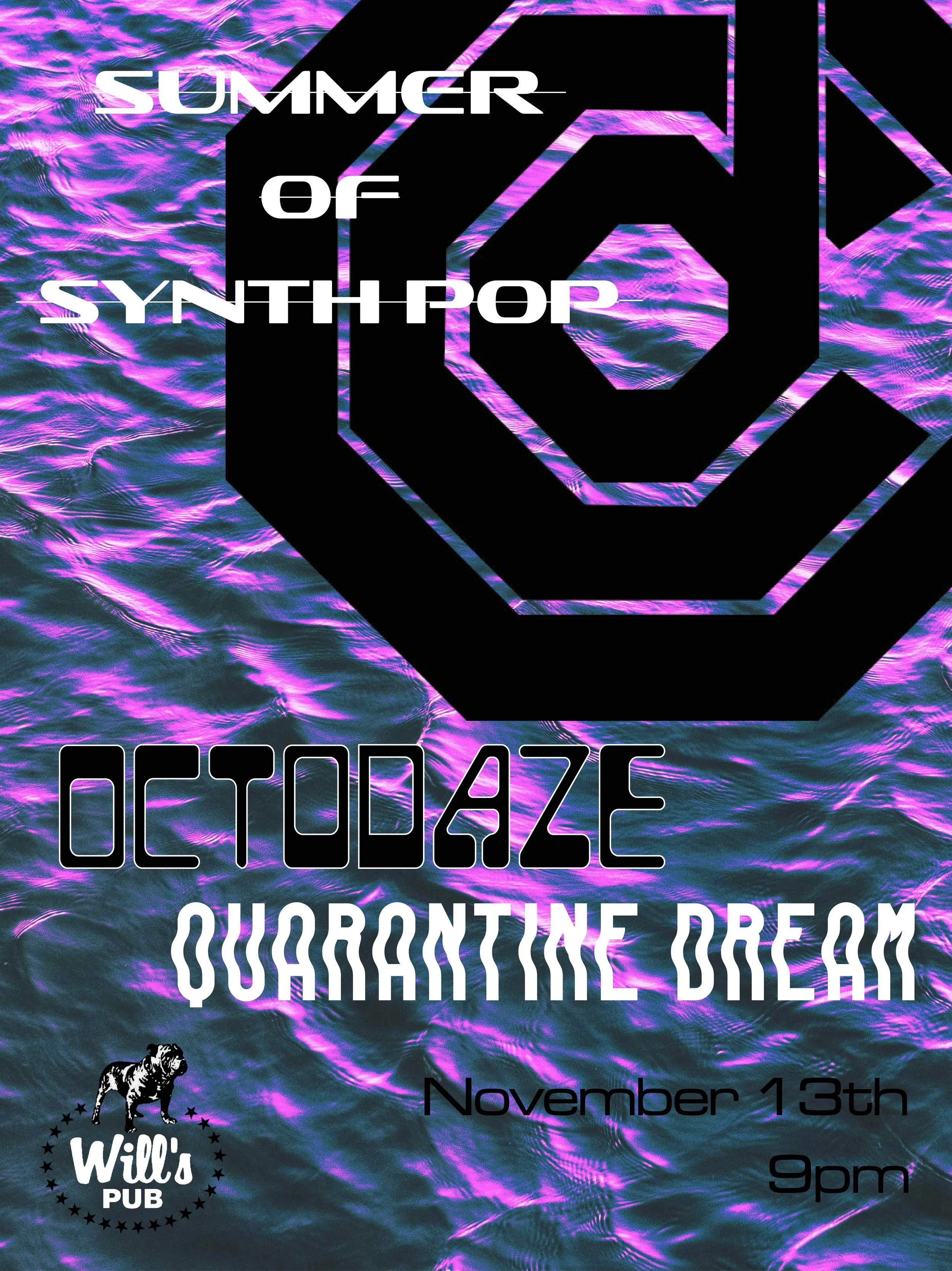
Poster designs for some of my favorite musicians.
I really like the gritty tones seen in old print processes and I wanted to replicate this look for the project. To do this I added reticulation and a halftone pattern. Blending modes allowed me to achieve a further level of textured appearance and using a gradient map added a mellow color which created more contrast.
This design was created as a promotional poster for two Orlando-based bands. I represented both artists through combined visual elements that can be seen on their album art.
The idea for for this poster design was to use alignment and scale to create a sense of abstract space. The challenge was deciding what areas of the main image to exploring blend modes found one that brought out the details of Herbie’s face while pushing areas back (his hands) further emphasizing abstract space. In the final stages I decided to bring in an exaggerated halftone to serve as a decorative element but also bringing all the elements together.


