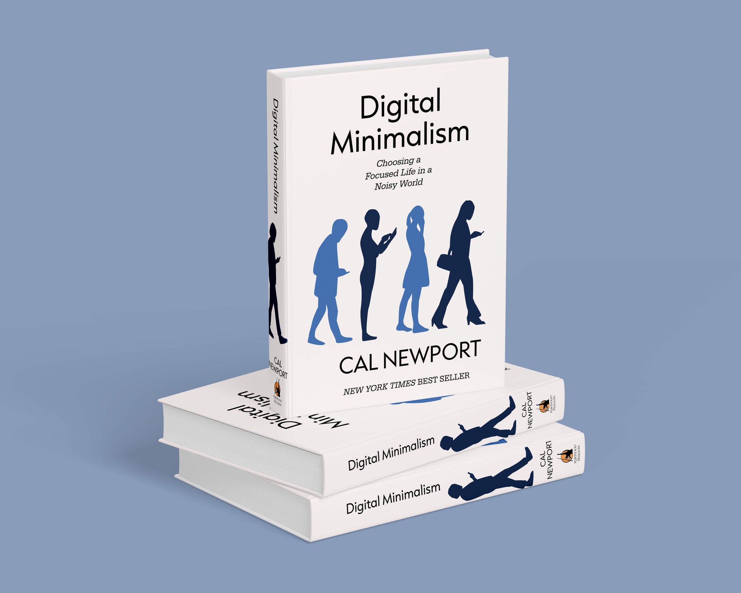
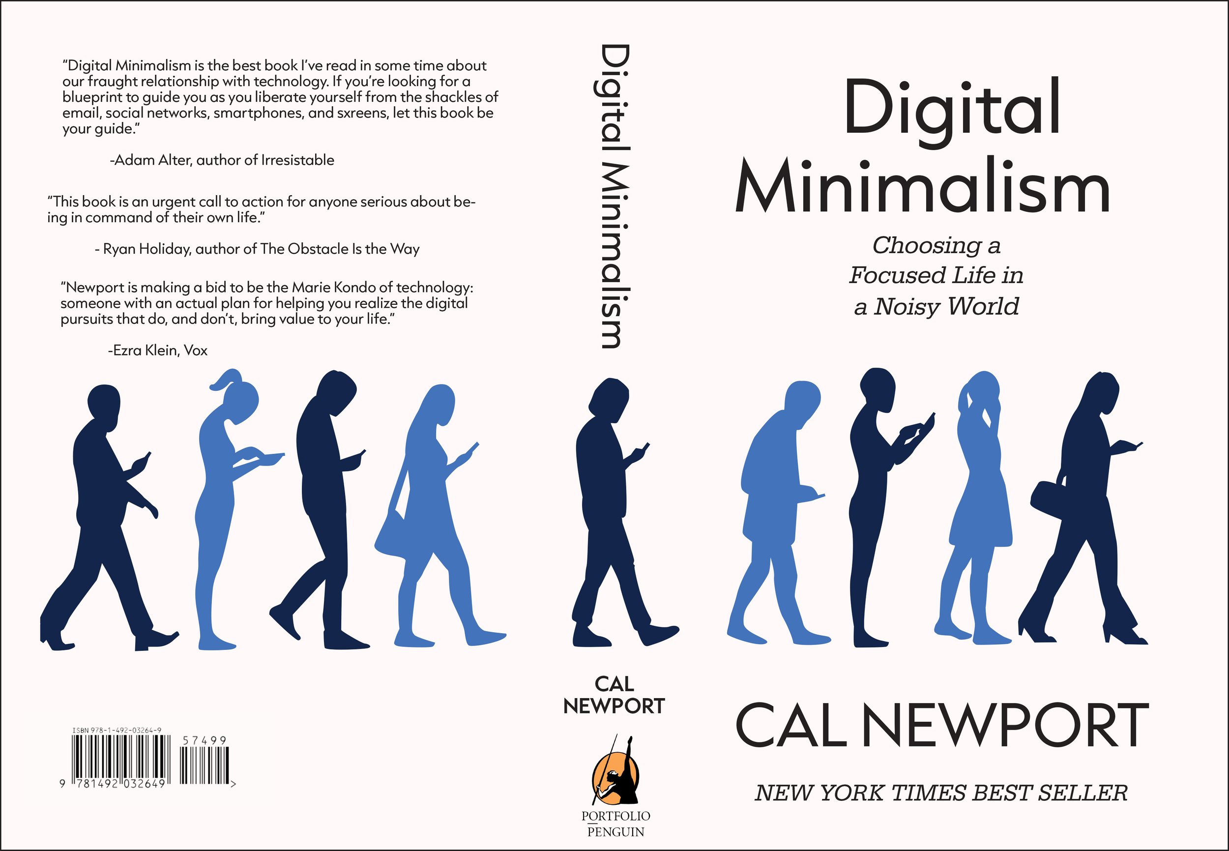
Re-envisioning a book cover.
When approaching this design the challenge was to re-create the cover for Cal Newton’s Digital Minimalism, not only to offer a visual interpretation of the book’s core themes but to also quickly catch the reader’s eye.
I chose to fuse minimalist aesthetics, symbolism and strategic color by combining white space with repetitious silhouettes in the same colors of the viewer’s favorite social media logos.
This created a contrast that was dramatic and more likely to engage them by grabbing their attention. Once their initial interest was sparked, the viewer would then notice the silhouettes showcased a diverse range of postures, clothing, and personalities yet, despite these differences, they are united by their shared captivation.


Magazine layout for a spooky article
When I was growing up, around the fall season I would always look forward to finding a copy of the Halloween edition of Martha Stewart’s Living Magazine. There were all kinds of great ideas to make the time of year extra special, so creating this layout was a chance for me to relive that nostalgia and really create it with my own vision.

